top of page

Blank Spaces
Regain control of your life and mind
in a world of digital distractions.
In this UX/UI case study, we explore the design evolution of an innovative app dedicated to combating digital distractions. With a focus on empowering users to regain control of their digital lives, the app enables customization of minimalist widgets for essential applications. Our study delves into the process of crafting a serene and focused user experience, emphasizing simplicity and personalization.


01
Exploration
After performing an audit of the existing IA, I conducted a remote usability study among five users. Using their feedback to identify the primary user pain points, I then redesigned the app’s IA to address these issues.
02
Typography
03
Color
04
Screens and Visuals
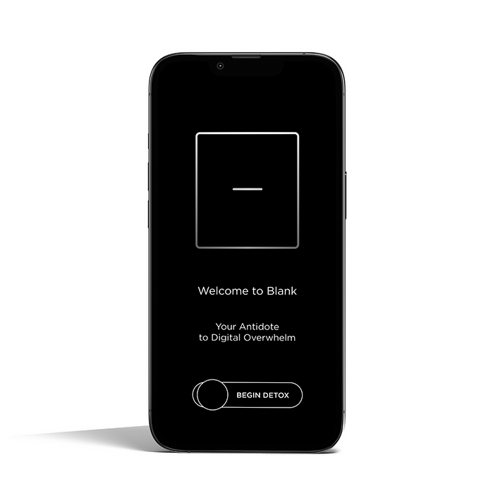
A complete redesign of the app’s UI and UX, including the introductory screens, set-up screens, the introduction of a central user dashboard, new functions such as a screen-time tracker and app blocker, and custom animations.
05
Summary
After conducting user research and design exploration, I was able to effectively redesign this app’s user interface and user experience. By updating the introduction, set-up process; introducing interactive design elements, custom animations and new features, with the help of the app’s developer, we transformed the user experience from something that was confusing and at times frustrating, to something that is intuitive, easy to understand and enjoyable to use.
01
Confusing Introduction
Users had trouble understanding their end goal at the outset of the app. We received feedback that the benefit of the app was unclear, and that users struggled to understand how the app would function. To solve for this, we revised introductory copy, as well as the user flow in the intro, adding animations to give the users a better understanding of how the app would function, as well as how it would change their day-to-day experience interacting with
their phones.
02
Boring Experience
While this app is intended to be hyper-minimalist in design, some users reported that they found the interface lackluster, and had a desire to see a more interesting and interactive UI. To solve this issue, we redesign the introductory visuals, added more interactive buttons, and
custom animations.
03
Arduous Set-Up
Multiple users provided feedback that indicated the set-up process was not only confusing, but that the app’s design required many additional steps outside of the app in order to complete set-up and installation. While some of these variables were out of our control due to privacy restraints, we mitigated these issues by reimagining the process as a whole, and giving the users a more positive and interactive experience through the UI and user flow of the
set-up process.
bottom of page